App Push Editor
Agillic // UX Design // 2022
Designing a simple yet scalable solution that meets our users’ expectations.
Introduction
This project was a part of a larger strategy where the whole front end of the Agillic platform was being refactored in React. Everything from the login screen, dashboard and the assets manager to multiple rich content editors, data setup, flows builder and reporting tool were going to be redone and at the same time improved from a UX point of view. For further context; read more about the long term strategy of the Agillic redesign.
In this portfolio case you’ll find just a few of the many design decisions behind the solution and some insights into our processes. I’ll be happy to provide more details if relevant.
The challenge
Agillic already offered an old push service capability, however we didn’t have any end-to-end solution and implementation through an SDK. Through market research and interviews with existing clients and prospects it was deemed critical being able to offer a complete app push notification solution in a short amount of time.
My objective was to design a solution for an MVP with the ability to easily add future capabilities in the design. The user experience should be easily understood and require a minimum effort to execute although still provide the user with the powerful capabilities that the Agillic platform provides.
Insights forming the concept
After exploring the basic capabilities of an app push notification we defined an MVP. Asking our users we discovered that they were expecting a similar experience to how they were using our newly designed SMS Editor.
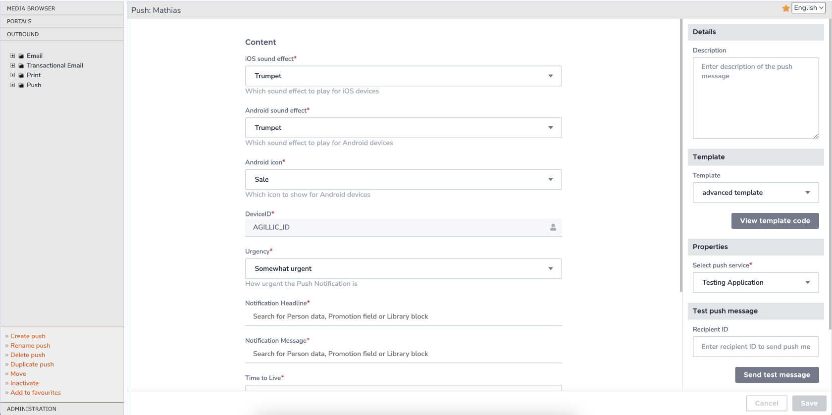
We knew that our old template based editor – where everything was set up using custom fields – was causing some confusion amongst our users. Now we could design a solution based on predefined fields, which gave us the possibility to guide the users in a much clearer way and present them with what looks like a real editor including a preview of the message.
Consistent and familiar
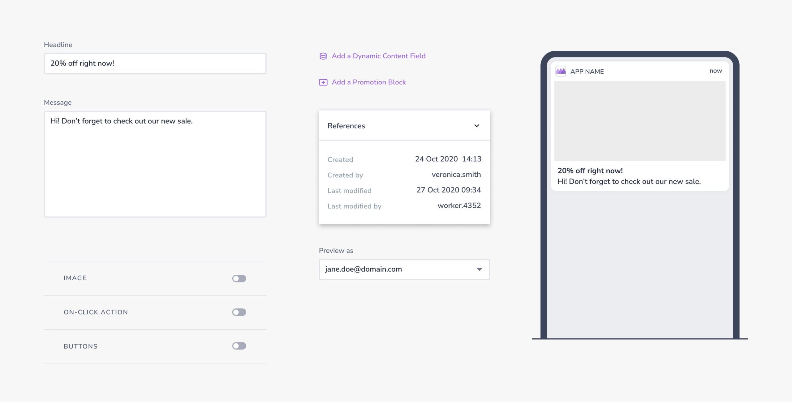
App notifications are quite similar to SMS messages in function and form, and are also often received on the same type of devices. I aimed to create a consistent experience across the two editors and by doing so reduce the learning curve of users using both editors.
In this project we also created the foundation for the ux-pattern that is to be used across all the editors, including future projects. A basic, but solid and consistent foundation that should work in a predictable way. Using a properties panel that provides contextual options to the selected element is one of the patterns that continues throughout the redesigned platform. We also decided to use modals for more complex tasks that require space and focus from the user to set up correctly. Compared to other possible solutions, like using inline editing, we’re making sure that the user stays on the important task, completes it successfully by validating the input and gives the option to cancel if needed.
Looking at competitors and other editors helped us find common patterns that would create a certain familiarity in the interface. In combination with our own design system we created components that solve the jobs-to-be-done and at the same time provide them with the powerful capabilities provided through the Agillic platform to segment and personalise their message.
Context at the right time
By talking to our Customer Support team, looking at our product feedback board, and also asking our users directly we knew there was a huge need for more contextual help in the product. Just by providing more explanations could in many cases remove a lot of the doubt and uncertainty that our users were experiencing. We knew however that we had to be careful not to overdo it taking too much space and focus from the task at hand. It’s a tool you use everyday where efficiency is key.
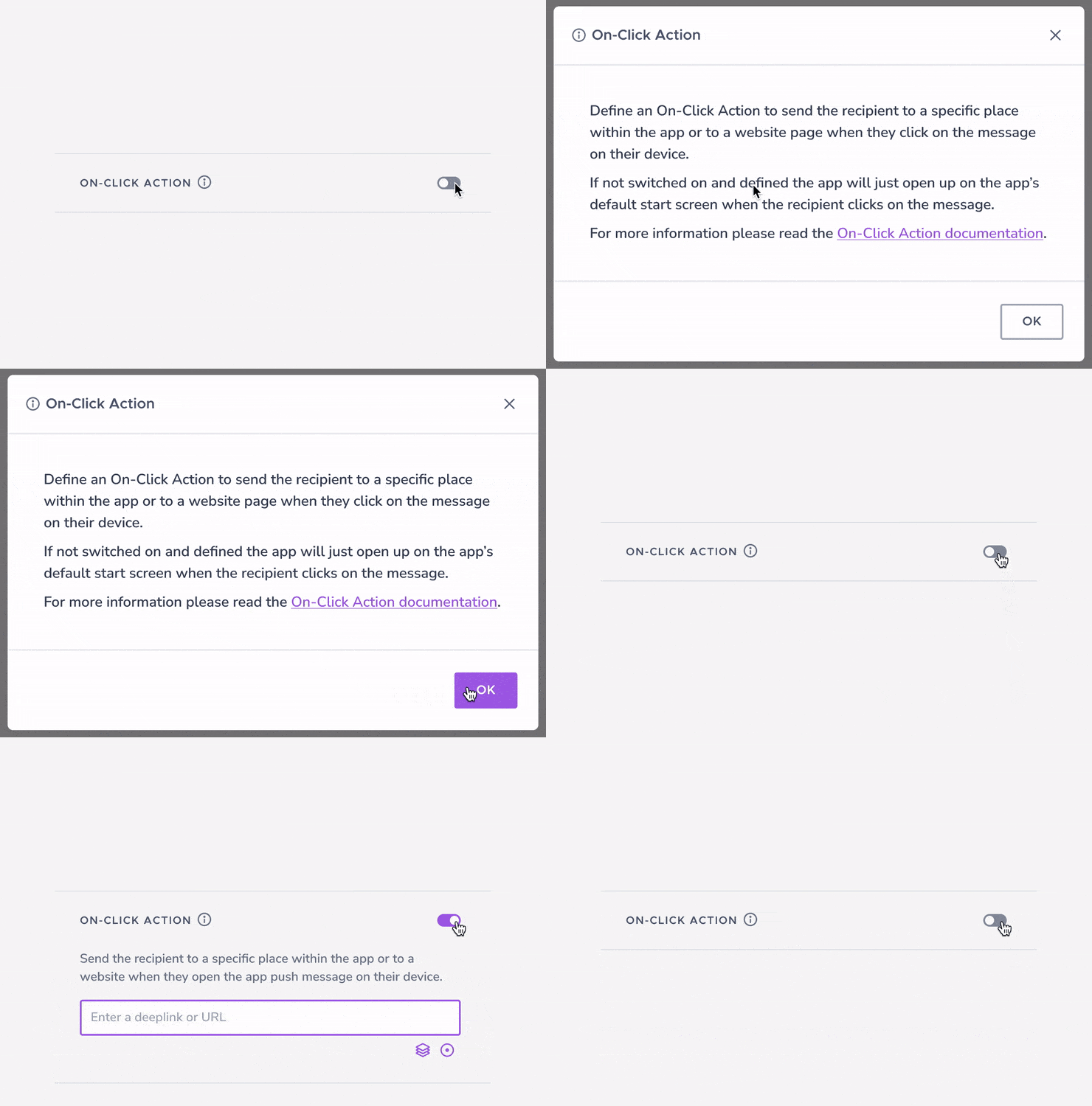
Beside each feature we placed an info icon that appears on hover, and by clicking on it the user can learn more about that particular feature. The information is easily accessible, but is not cluttering up the UI when you aren’t interested in the feature. In combination with using better, descriptive labels, tooltips and toasts, we created a set of improvements that we could validate through user tests to solve most of the identified issues.
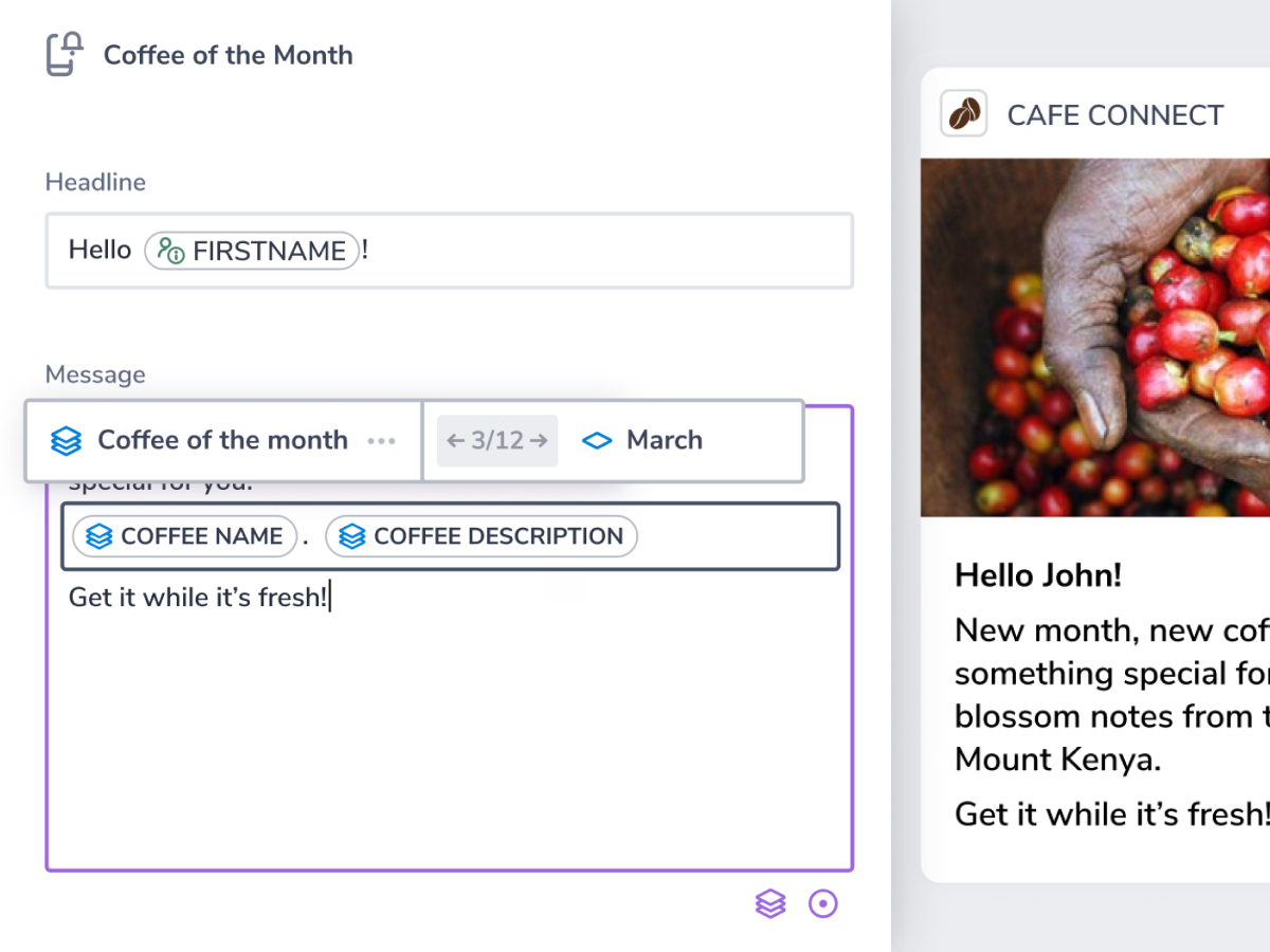
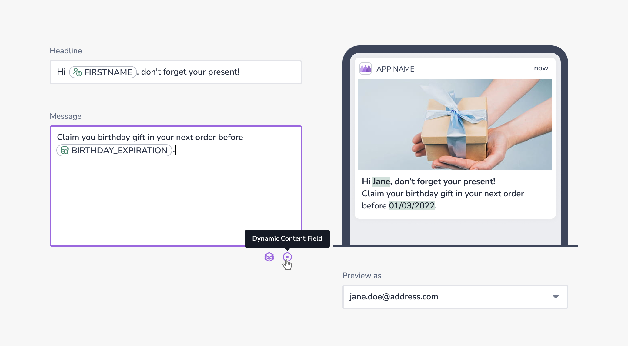
When having a specific field selected we show some essential options right where you’re at. Small icons that are easy to find which keep you focused on the content you’re working on. These quick-options are not different from the ones you can find in the properties panel, however it prevents you from going too far away from what you’re doing just in order to look for an often used option.
Flexible yet simple
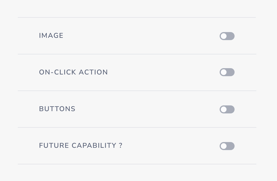
As established early on, we saw a need to implement more capabilities in future versions. Designing a solution where it was easy to add new features was important, and after exploring multiple different approaches we decided on a collapsible feature set. This way we could add new capabilities without rearranging the layout and meddle with already implemented features.
Another important aspect was to reduce the cognitive load as the editor grows larger and gets more complex. Having features turned off and collapsed means that the user doesn’t have to think about it or take any active decision if it’s something they don’t want to use.
A powerful preview
The data setup in Agillic provides many strong options for segmentation and creating personalised messages. By providing a preview right beside the editor creates an immediate understanding of what you’re doing. Combining that with the option to see dynamic data on the fly from a recipient of your choosing makes you confident in your actions.
The result
From a UX point of view the challenge was to combine our users’ needs of wanting a simple and recognizable experience with the business requirements of having a scalable yet powerful editor utilising the capabilities in Agillic where dynamic data, use of Promotions (sort of a headless CMS for segmented, cross-channel content) and preview capabilities.
At the same time we had to consider a design that should be consistent to our other editors, that aren’t actually designed yet. Developing a UX foundation that is usable in many different use cases has been challenging, however it seems that we’ve come to create a stable structure and interaction pattern, building flows and a UI that feels intuitive and efficient.
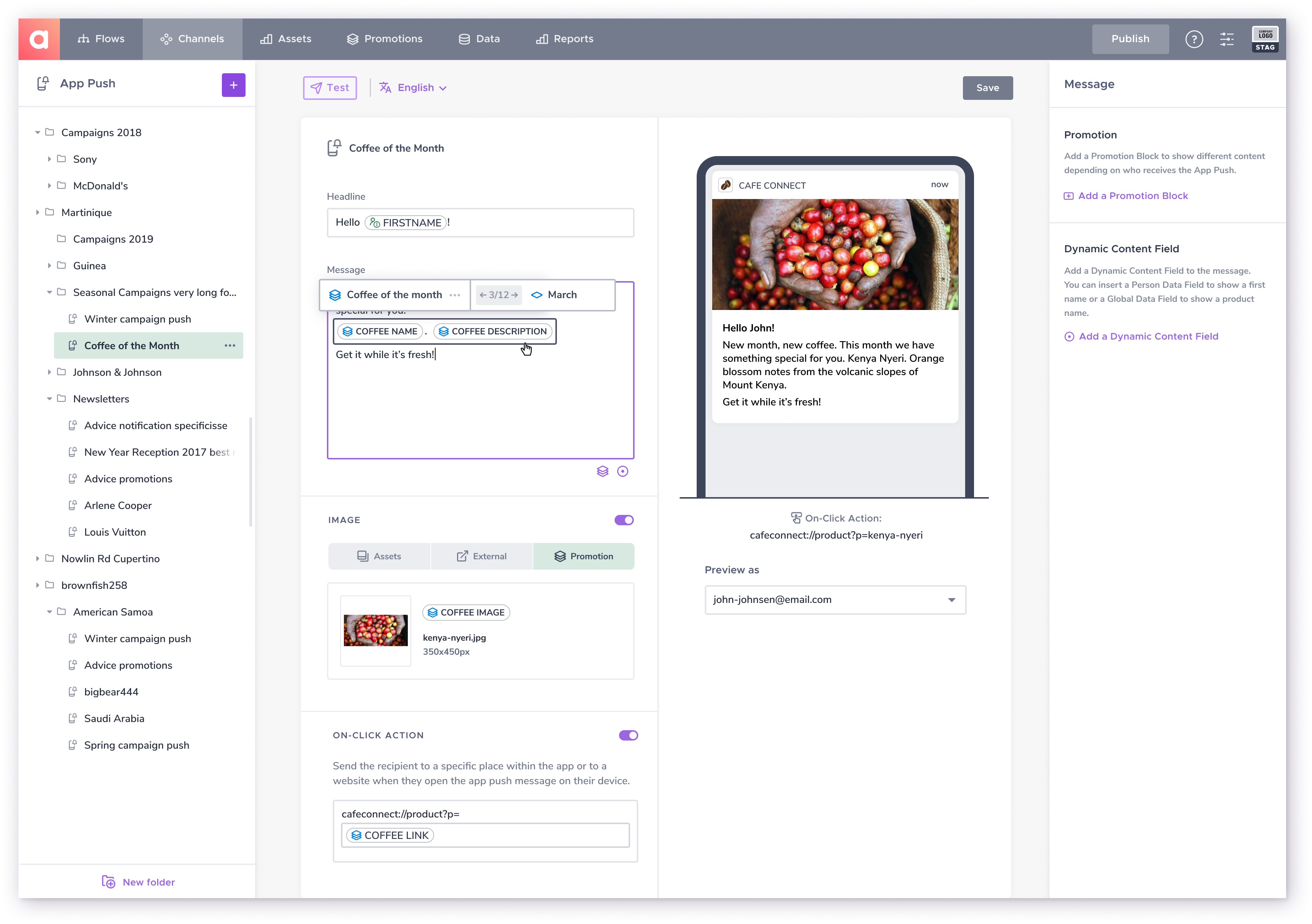
The editor is currently released as a beta-version to selected clients and we’re getting great feedback so far. Now we will continue to incrementally build on the MVP and improve it alongside our users.
As with any project, I already have a list of improvements I would love to implement, however it seems that the product is in a good spot right now. Not only with this particular new editor in mind, but also when it comes to having a strong UX-foundation to work from going forward. One thing I would like to focus more on is to improve the efficiency working in the product where hotkeys and keyboard navigation is a very important aspect.
For more information I’d be happy to go through the project in more detail.
The Agillic redesign
Agillic is a Digital Marketing Automation Platform for marketers to communicate with their customers cross-channel via email, web, print, sms and app notifications. The platform has a strong reputation due to its technical features and data structure, however the user experience has not been on par. The product has a lot of complex functionalities with many possibilities of using data to target specific customer segments and personalise your communication to them, which is great for a successful marketing campaign – if you understand how to make use of it.
This issue has been a growing concern for the company. During interviews and field studies it was clear that a lot of the potential of the product was not utilised, as the users had problems understanding the product due to the way the experience was designed.
The strategy is to make a complete redesign of the platform and at the same time refactor the code in React. Since this is a huge project we are redoing and releasing parts of the platform throughout a longer period of time. This gives a lot of challenges since the redesigned features then have to be compatible with legacy capabilities. Because of that it has been important to have the final vision of the platform in mind when designing each feature, while simultaneously being able to deliver functioning solutions that fits into the current state of the platform.